Increasing interactions
on the MOME University Life Platform
A case study on the app and recommendations on its development based on real research data
Context
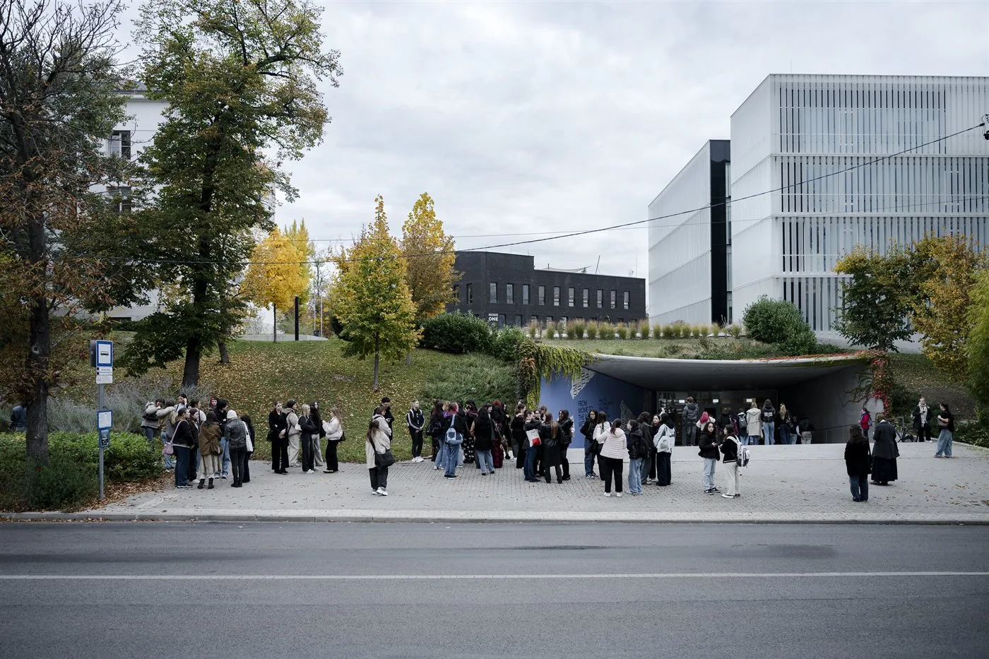
MOME is a university of art and design in Budapest, dedicated to foster young talents from Central and Eastern Europe.
Application
The app does not offer any real value to the students for them to prefer it over the other communication channels of the university (e.g. email, instagram, posters, word of mouth)
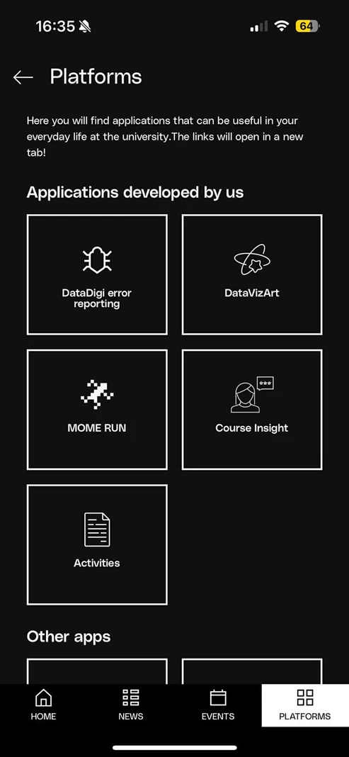
*screenshot from the ULP app
Reality
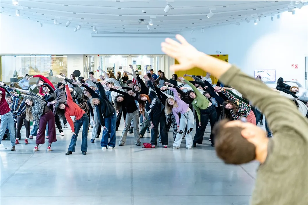
The university caters to students with many recreational activities and opportunities, but these are often missed out on because of the flooded communication channels.
I wanted to find out why students don’t use the app
method: cognitive walkthrough
There is a calendar view, but
I can’t see any events marked...
If I manage to save an event that
I like, it is quite hard to find it.
Most useful features (like canteen, printshop) are just links to the webpage
so they just encourage me to leave the application...
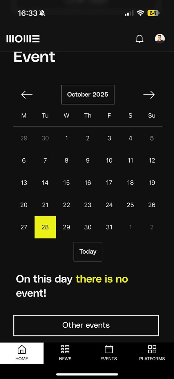
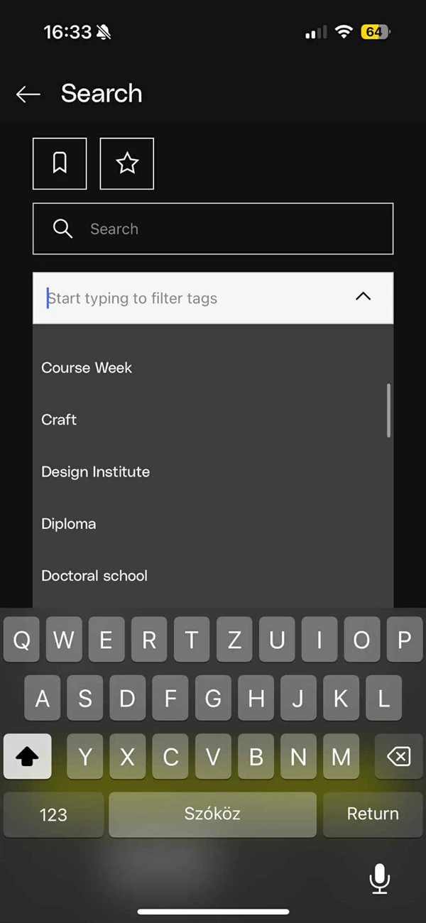
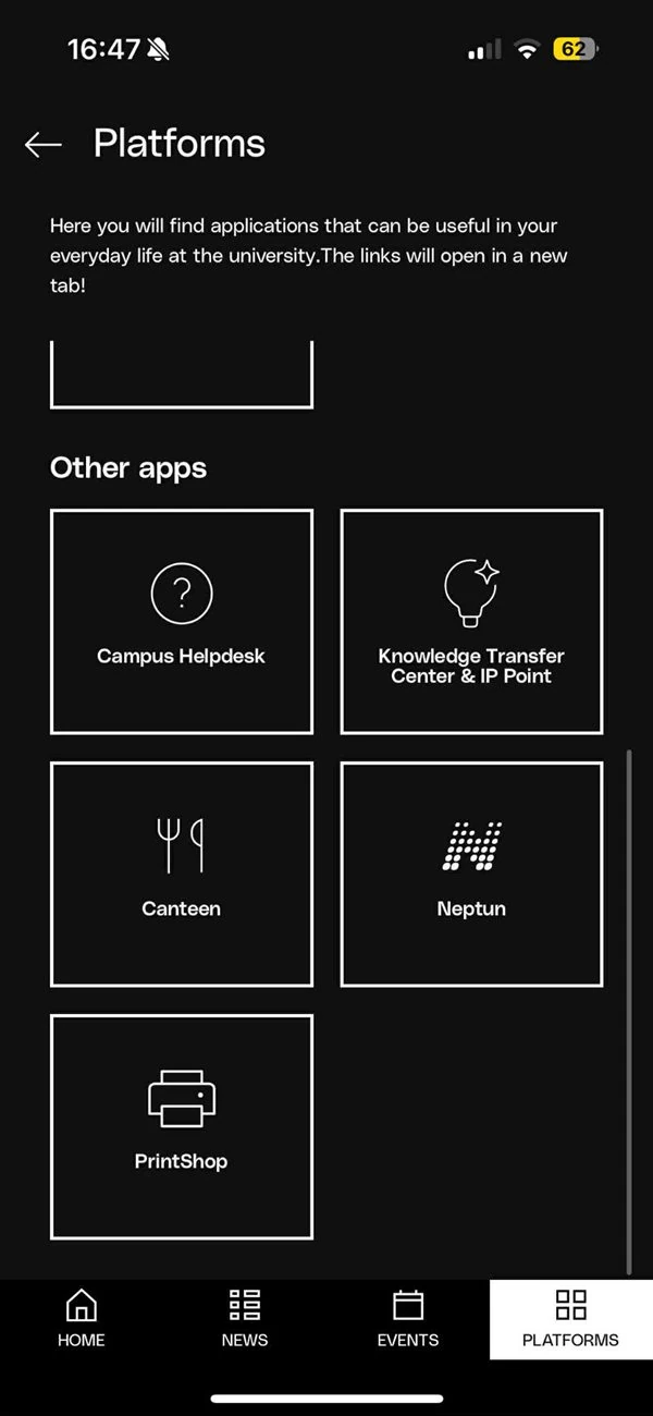
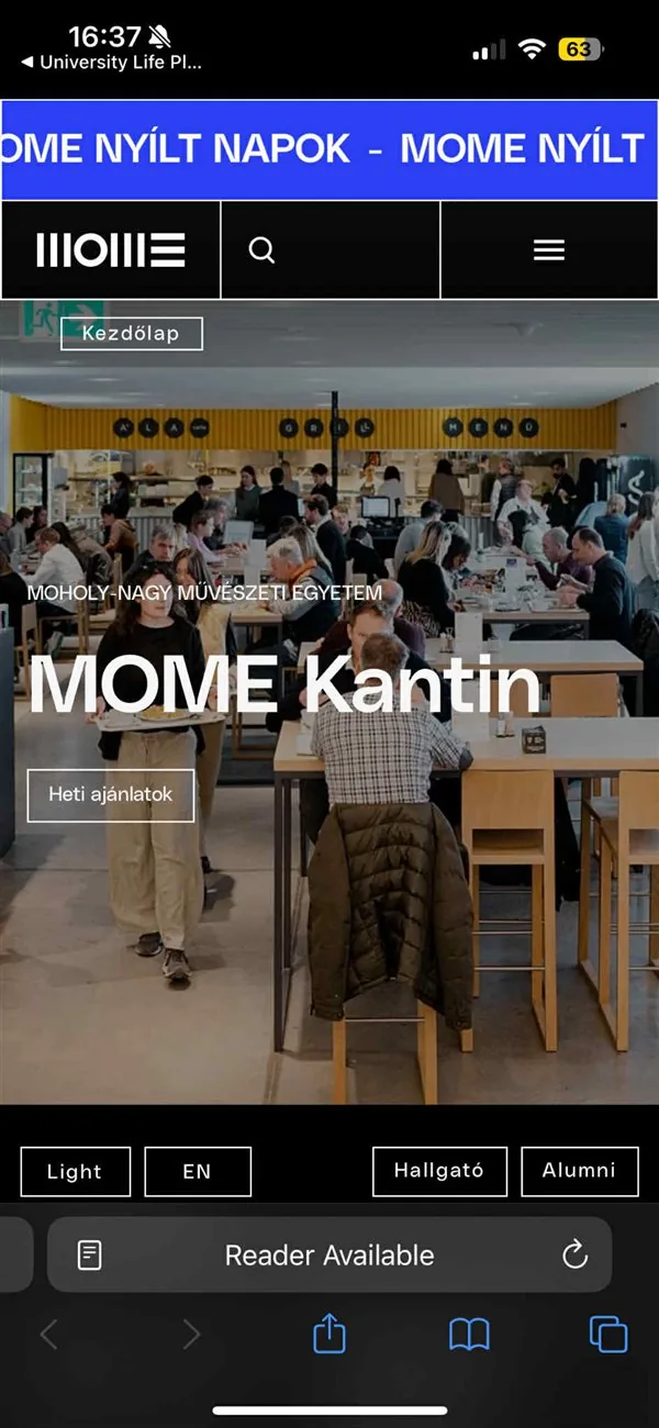
I asked fellow students about the app and how they navigate university life
method: interview
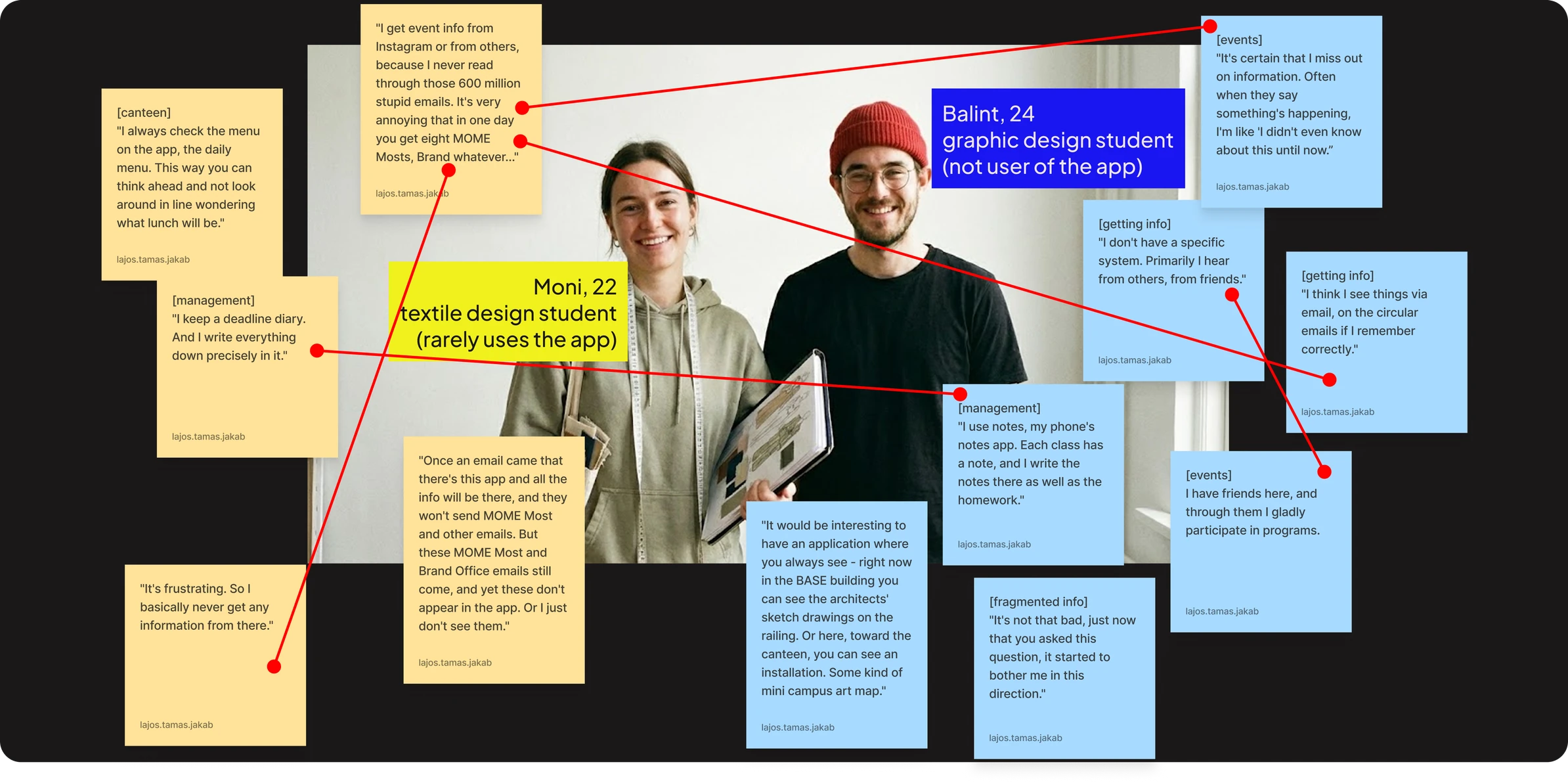
Having collected all findings I came up with the following clusters:
findings
Communication
Events
“The app’s events section focuses too much on official exhibitions and conferences.”
Peer to peer
“I usually just ask someone instead of opening the app.”
Fragmented information
“We use multiple platforms, but they don’t connect or share information.”
Unreliable teacher communication
“There’s a class, and then they suddenly decide, “oh actually I’ll hold it from 3 to 10 a.m.””
Neptun
“It’s the devil’s work. If I don’t have to, I don’t use it.”
Student-teacher
“Department info comes in separate subject emails. So that’s handled, if we get information about anything at all.”
Student approach
Note-taking
”I would like to have a planner inside app, if i have something to do for subjects, deadlines, assignments...”
Not part of routine
“Having a problem because there is nothing to do in this mobile app”
Unaware of app
“We don’t really talk about the app - my classmates from the department probably don’t even know what it is.”
App issues
Information Architecture
“It’s frustrating to save content and not know where to find it later.”
UI
“The app could be brighter, more colorful — it’s too sterile. I think MOME wants an elegant and refined look, but students aren’t really like that.”
Links
“I don’t like that many things are just links to the MOME website and it redirects me”
Filtering
“Although onboarding lets you pick topics, information still isn’t personalised enough (by program, institute, status).”
Student ideas
Technical requests
“Having a MOME card in the mobile app will be useful because in that case we can use app for access to the our spaces on uni ... ”
Resources
“Struggling to find and getting information about MOME sport program”
Community
“I wish the app showed other students’ works or in-progress projects.”
The main issues that I found were that:
synthesis
University life happens on too many channels (Email, Teams, Facebook, Instagram), making students anxious they are missing out.

The current platform is more of a directory of hyperlinks that kick users out to external browsers, breaking their flow.
Students feel like a lot of MOME’s resources could be integrated into the app. Let that be more information, or utility features.

Students default to pen and paper because digital tools fail to capture the nuance of in-person verbal announcements.


How might we unite and target informational channels so that MOME students get the right amount and relevant information to them?

How might we make important information that is only mentioned during classes in person trackable so that it is not lost?

How might we eliminate external links so that MOME students have an easier time navigating the platform while also keeping the important information they point towards?

How might we integrate more resources into the app without making it feel overwhelming?
I needed to see which information is viewed by most students, most of the time, and which is least often
navigation prioritization
All of the time
Digital Library and Library Access – eBooks and media resources
Contacts for academic advisors and mentors
Canteen Dining Options – Meal plans and dining choices
Events
Guide to TechPark Access – How to book TechPark
Booking for wellness sessions
Guest Lectures and Events – Calendar of special events
Academic Calendar – Key academic dates and deadlines.
Timetable: academic and social events

Alumni Network Introduction – Connect with MOME alumni
Campus Map – Interactive campus locations
Onboarding Tracker – Steps for the first 3 months.
Access to Innovation Centre Researchers
Orientation Schedule – Orientation week events
Important People – Key freshman support contacts
Account Setup How Tos – Email and platform setup, Teams, Neptun details.
Health and Wellness Tips
Course Registration – How to register for courses.
First-Year Course Materials – Syllabi and readings
None of the time

I grouped the content according to the level of priority and topic
information architecture
Home
Now+Next
Events
Academic Calendar
Guest Lectures and Events
Canteen
Resources
Wellness and sport
Booking
Counseling
Wellness tips
Study tips
Gym access
Sport club info
Freshmen info
Campus map
Onboarding tracker
Orientation schedule
Housing info
Account setup
Course registration info
First year’s Syllabi
Scholarships
Financial aid
Scholarship info
Library
Techpark
Techpark guide + booking
Equipment lending
Contacts
Mentors
Freshman support
IC Researchers
Alumni
Wireframes
I prefer mapping out my ideas on paper first
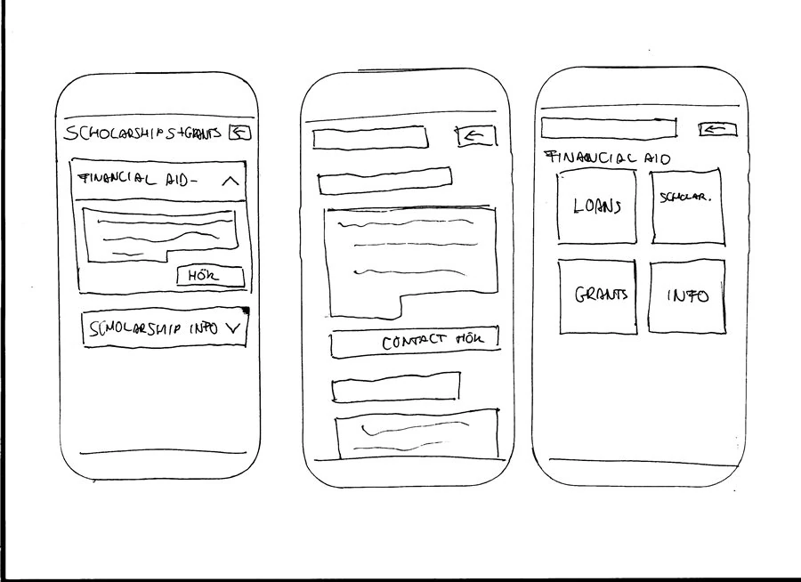
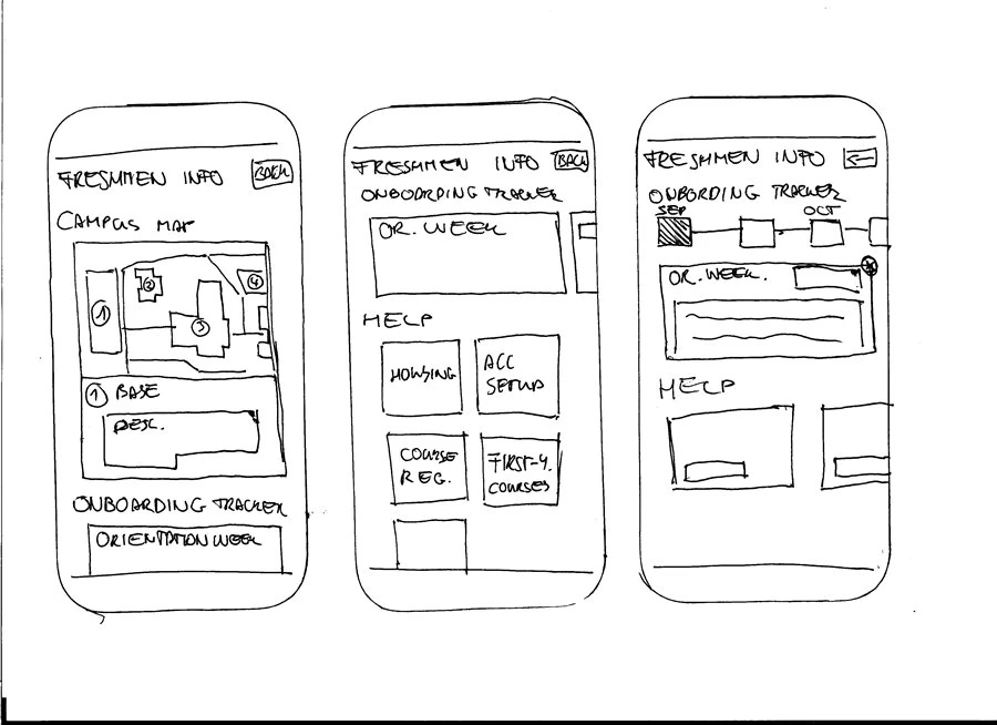
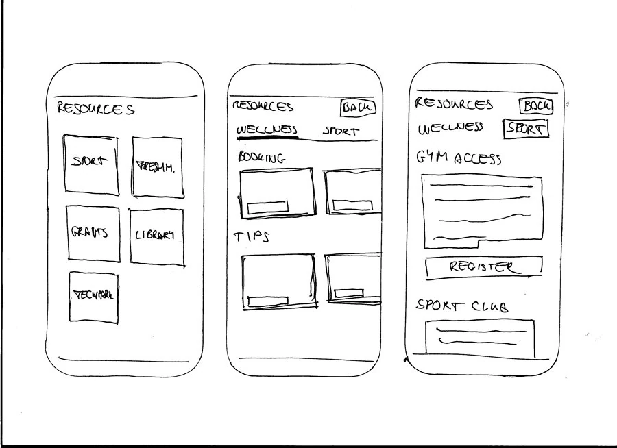
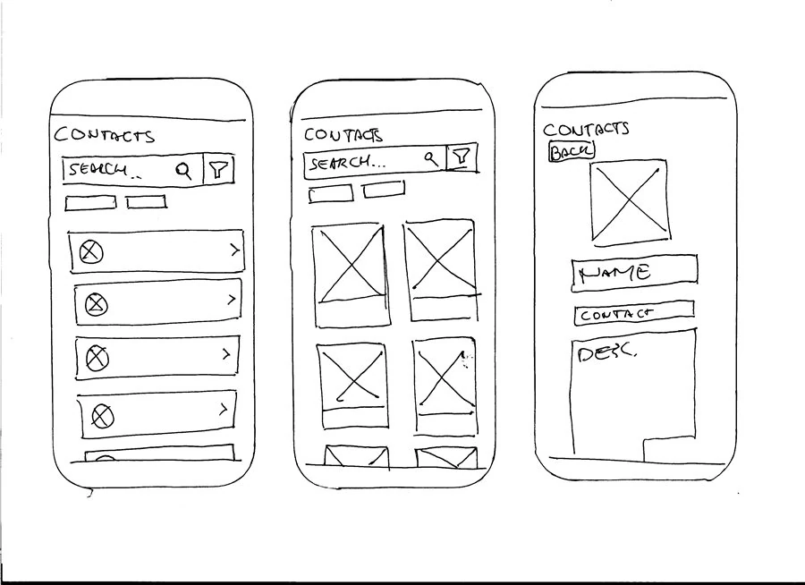
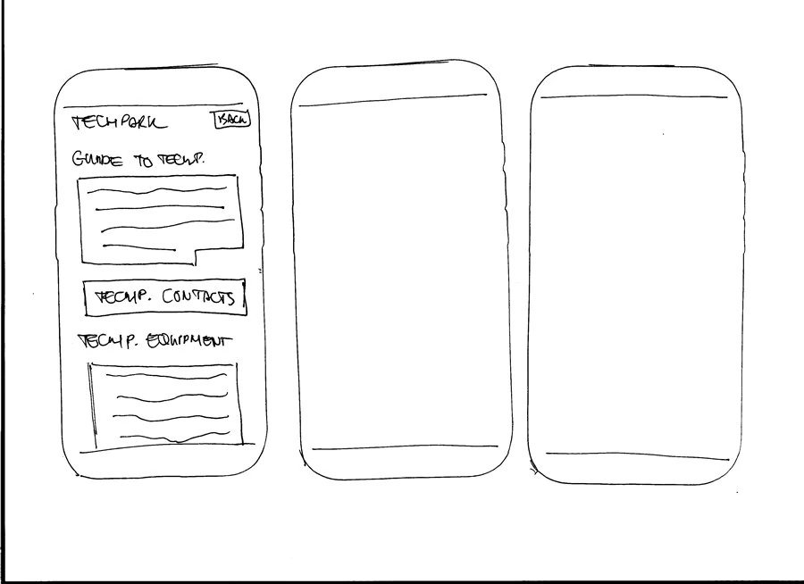
I did a series of usability tests as time was scarce and I needed fast progress
method: R.I.T.E. + think aloud

Repeat 3 times
Test

Identify

Fix
I asked the students to complete the following tasks:
Task I.
“You see an interesting campus activity coming up next week.
How would you keep track of it so you don’t forget?”
Task II.
“Show me where you’d go to check the details of that activity you kept track of.”
Task III.
“You’re planning to eat lunch on campus today.
Check what food options are being served right now.”
Task IV.
“You’re looking to join an athletic club or stay active this semester.
How would you explore your options?”
First participant
method: Think aloud
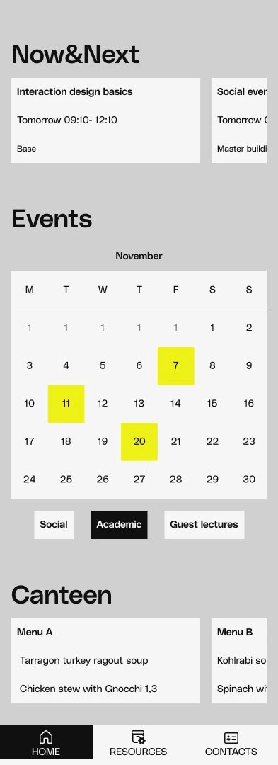
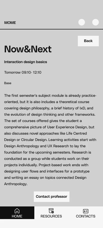
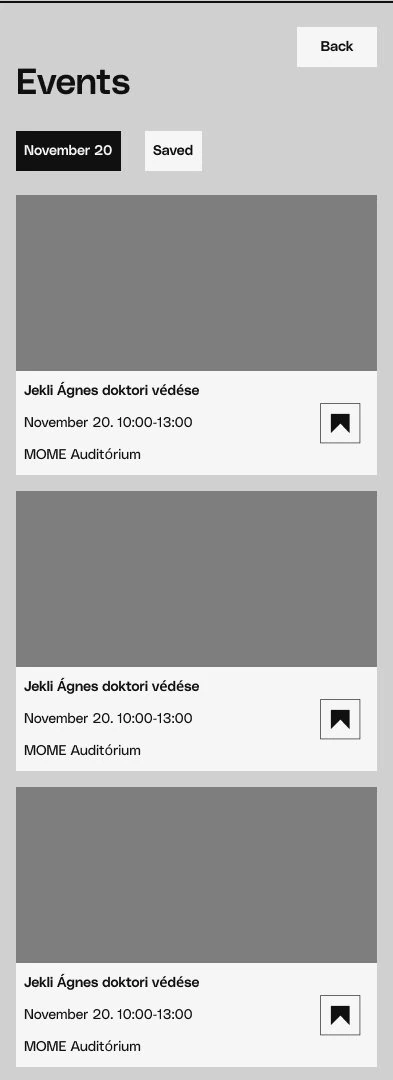
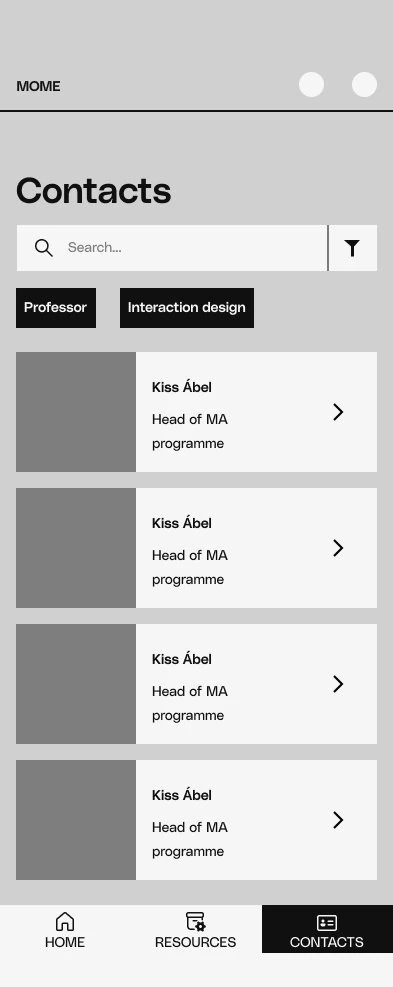
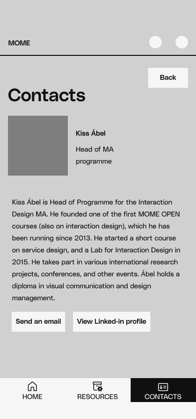
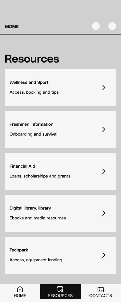
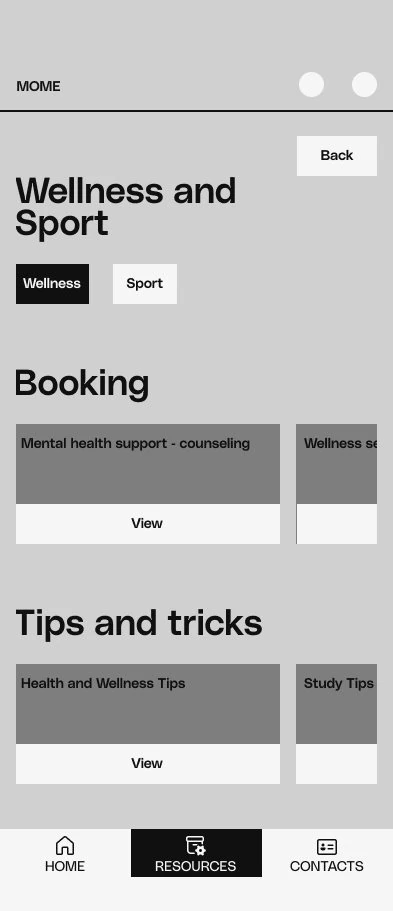
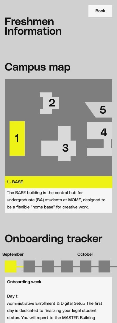
“It’s hard to find events like this, a separate page would be nicer”
“I’d like the home page to be more personalized.”
“It would be nice so see events and lectures separately”
“News?”
“I would expect the calendar to be here.”
“I don’t think I look for contacts this often”
“You should put some bigger categories here, like subheadings”
“I’m expecting to see the offices under the buildings, would be useful.”




Second participant
method: Think aloud
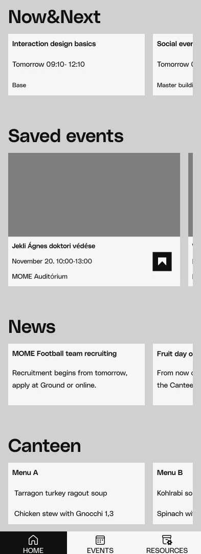
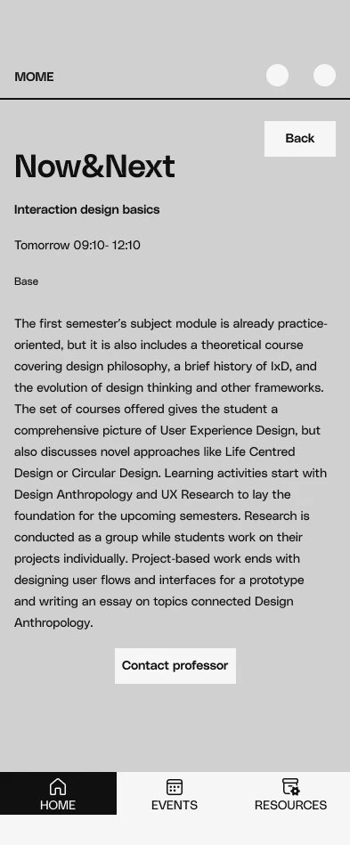
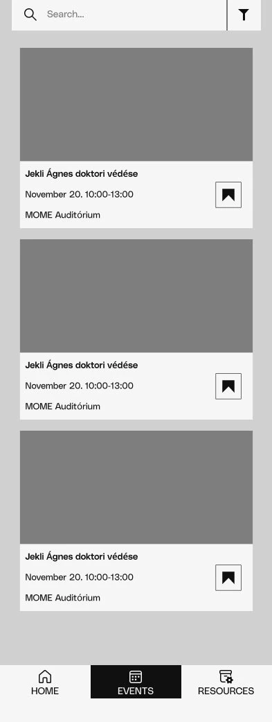
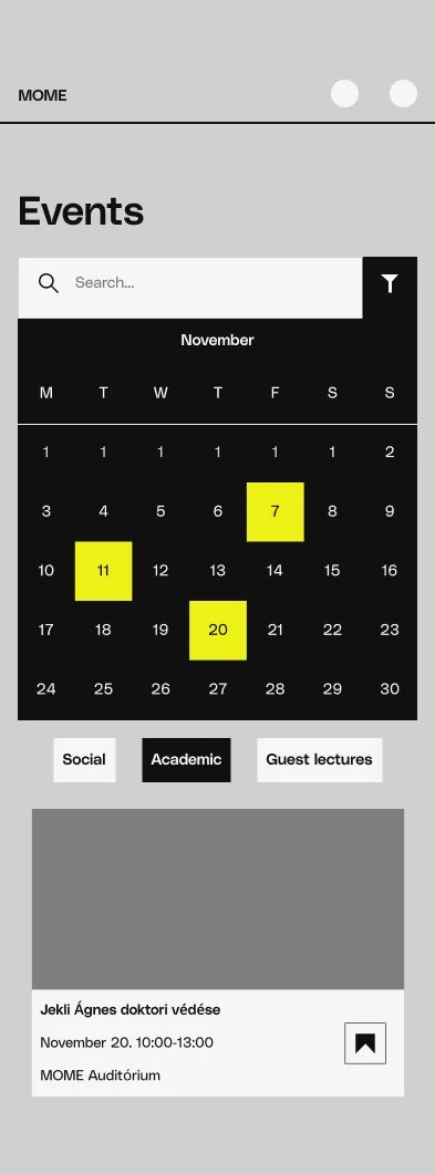
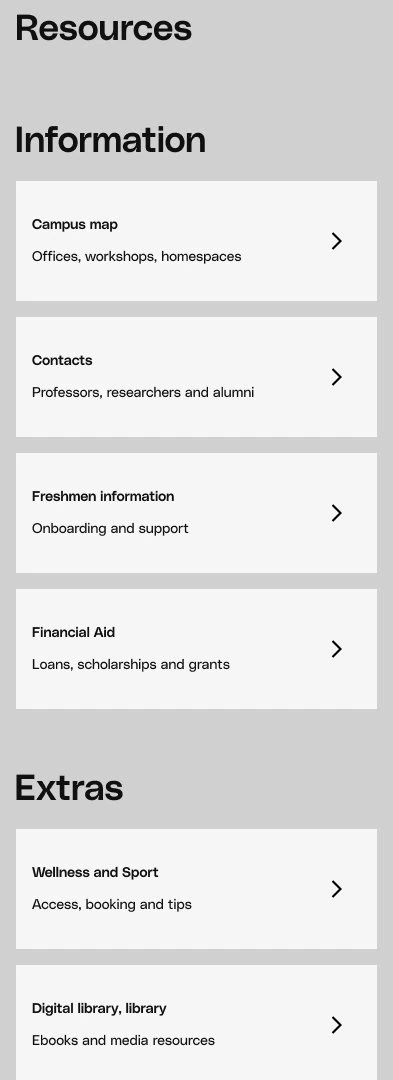
“I would like to see pictures here, you know, like in a newspaper”
“It’s too small”
“You could add icons here, it’s hard to scan”
“Also, the extras doesn’t make sense to me, like sport??”

Third participant
method: Think aloud
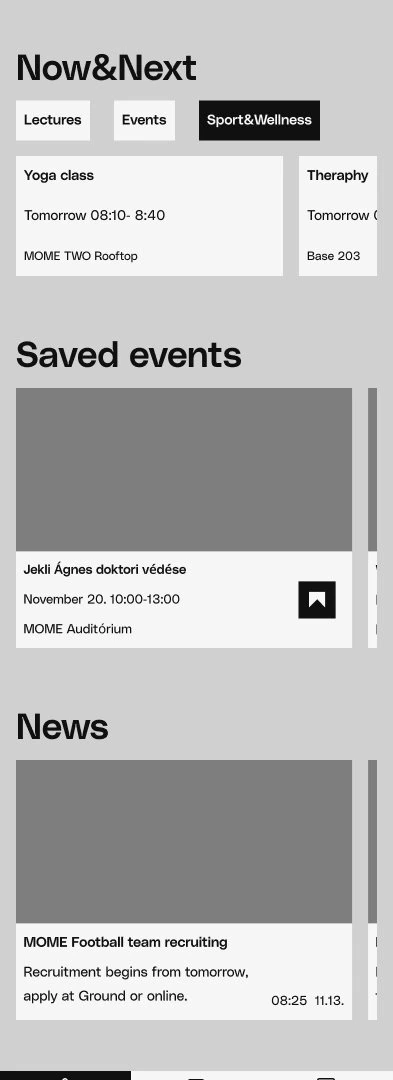
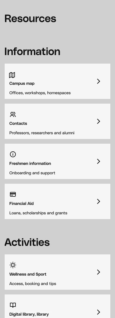
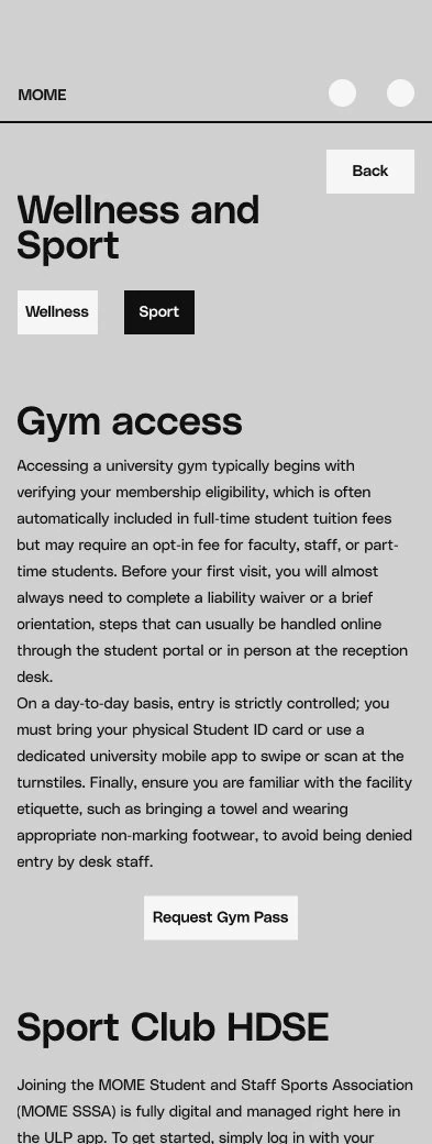
“It would be cool to see tomorrows classes here aswell”
“Hide my save events instead, if I already know about the event I know the date too.”
“I want to see all events here, so I can get inspired!”
“I really like the idea of contacts”
“This kind of swiping is really bad I think...”
“If there were email previews on the home page, I could decide if they’re worth opening or not.”
“This is a lot of words, I won’t read it”
“Would be nice to have a button here that shows me the gym on the campus map”

The results of the usability tests:
Scoring system:
4 (successful without problems) 3 (completes but could be smoother)
2 (struggles but completes) 1 (can’t complete)
Task I.
Task II.
Task III.
Task IV.
Participant 1
Success: 4
Time: 20 s
Success: 2
Time: 42 s
Success: 3
Time: 14 s
Success: 4
Time: 20 s
Participant 2
Success: 4
Time: 4 s
Success: 4
Time: 2 s
Success: 3
Time: 14 s
Success: 3
Time: 11 s
Participant 3
Success: 3
Time: 7 s
Success: 4
Time: 1 s
Success: 3
Time: 14 s
Success: 2
Time: 14 s
The prototype’s results compared to the original application:
Task I.
Task II.
Task III.
Task IV.
Prototype (average)
Success: 3,66
Time: 10,66 s
Success: 3,33
Time: 15 s
Success: 3
Time: 14 s
Task IV.Success: 3
Time: 16 s
Original application (average)
Task I.Success: 3,33
Time: 14,33 s
Task II.Success: 3
Time: 23 s
Task III.Success: 3
Time: 16,6 s
Success: 3
Time: 13,33 s